
What Is the 70/30 Rule in Interior Design?

The Secret Behind Balanced Spaces: What the 70/30 Rule in Interior Design Really Means
How a simple proportion transforms ordinary interiors into spaces that feel purposeful, human, and unforgettable.
Imagine walking into a lobby that feels calm yet inspiring, an office that feels focused yet energizing, or a retail environment that feels harmonious yet exciting. There’s an invisible force behind that experience — a visual rhythm that feels just right. Behind the scenes, designers are often using one deceptively simple guideline: the 70/30 rule.
Let’s take a deep dive into what this rule really means, why it works from a psychological standpoint, and how you can apply it to your own commercial spaces to create environments people don’t just see — they feel.
1. The 70/30 Rule: More Than Math — It’s Emotional Design
The 70/30 rule suggests that 70% of a space should be dominated by a primary design element — typically a dominant color or style — while the remaining 30% should be reserved for accents that add personality and interest.
It’s easy to reduce this rule to numbers. But the magic lies in why this proportion feels so right:
Our brains crave balance: Too much uniformity feels boring; too much contrast feels chaotic. The 70/30 rule strikes a psychological sweet spot between stability and surprise.
It builds narrative flow: The human eye naturally looks for patterns. With most of the space unified, the accent elements feel intentional and meaningful — not random.
It creates visual hierarchy: Dominant elements anchor the space, while accent pieces guide attention and evoke emotion.
Think of it like writing: the main body of text carries your core message (70%), while headings, images, and pull quotes (30%) add emphasis and flair. Without both, the piece fails to engage.
2. The Psychology Behind the Perfect 70/30 Balance
Have you ever walked into a space and felt instantly relaxed, or energized, or inspired — without knowing exactly why? That’s psychological design in action.
✔ 70%: The Foundation of Calm and Clarity
The dominant 70% serves as the visual foundation. It sets the emotional tone:
A calm, neutral palette can calm the mind and increase focus.
A warm, cohesive texture field communicates comfort and hospitality.
A minimalist, consistent layout suggests professionalism and control.
This large, stable portion gives the brain a place to rest — a background against which everything else becomes meaningful rather than overwhelming.
✔ 30%: The Engine of Curiosity and Emotion
The remaining 30% adds contrast, expression, and personality. These accent elements do more than decorate — they evoke feeling:
A bold color block can inject energy into a boardroom.
A textured wall can invite touch and curiosity in a reception area.
Carefully chosen artwork can reflect brand identity without shouting.
Here’s the twist: when you design for psychological balance, people don’t just see your space — they experience it.The 30% becomes the emotional punctuation in your design story.
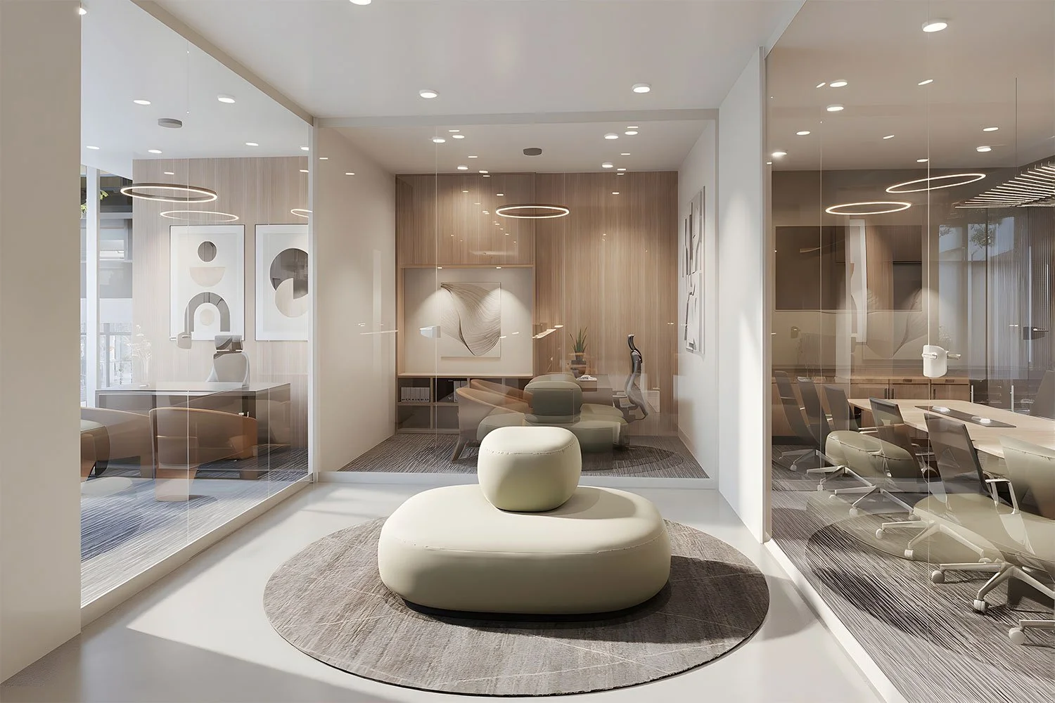
3. Applying 70/30 to Commercial Interiors — Real World Examples
This isn’t theory — it’s a practical system that can be applied to every type of commercial interior.
A. Reception Areas — First Impressions That Last
In a reception area, your priority is often to make visitors feel welcome and assured. Use:
70%: Neutral tone walls, unified flooring, consistent materials
30%: A statement desk, branded wall graphics, textured seating
The neutral field builds trust, while the accents invite engagement and create memorability.
B. Office Spaces — Focus, Flow, and Culture
Office design must balance concentration with creativity:
70%: Calming colors, ergonomic workstations, consistent lighting
30%: Color pops in collaboration zones, art installations, soft seating clusters
The result is an environment that supports productivity and human interaction — not one that feels disjointed or sterile.
C. Restaurants & Hospitality — Comfort Meets Delight
For spaces where mood matters, the balance becomes even more critical:
70%: Ambient lighting, warm color palettes, comfortable seating systems
30%: Accent lighting, bold pattern tiles, eye-catching décor
The dominant base relaxes; the accents captivate — a recipe for memorable experiences.
4. The 70/30 Rule Beyond Color — Materials, Textures & Space Planning
While color is the most common application, the 70/30 rule extends far beyond:
✔ Materials & Finishes
Think of material dominance as a tactile conversation:
70% smooth, calming surfaces like matte finishes and soft upholstery
30% textured, engaging surfaces like woven fabrics or natural wood grain
This balance invites not only visual but sensory interest.
✔ Textures
Using texture strategically can create depth:
70% consistent textures (e.g., polished concrete, flat walls)
30% contrasting textures (e.g., luxe rugs, tactile wall panels)
This adds layers and richness without overwhelming the senses.
✔ Space Planning
In workplace design, the rule can guide layout:
70% focus areas — dedicated workstations or calm zones
30% interaction nodes — breakout spaces, meeting pods, artistic interventions
This ensures you’re designing for both productivity and connection.
5. The 70/30 Rule & Brand Identity
In commercial design, your space is an extension of your brand.
Dominant Elements Reflect Your Core Values
Your 70% establishes the emotional baseline that your brand lives in — calm, confident, minimalist, or vibrant.
Accents Tell Your Story
The 30% becomes your visual voice. This is where you:
Elevate brand colors in key moments
Showcase mission-driven artwork
Introduce bespoke design features
This balance ensures your space doesn’t just look good — it tells your story.
6. The Evolution of the Rule in Modern Design
Design wisdom evolves — but the core human craving for balance remains constant.
Today, designers combine the 70/30 rule with trends like:
Human-centered environments — prioritizing comfort and functionality
Biophilic design — integrating nature through accent features
Flexible, modular spaces that support shifting work modes
These contemporary trends all benefit from a base of balance and contrast.
7. Why the 70/30 Rule Works — From Brain to Behavior
Let’s break it down in human terms:
Our Brains Love Predictability
Have too much contrast, and we get overwhelmed. Too little, and we disengage.
Our Eyes Seek Movement
The 30% accents give the eye a reason to travel around the space, discovering layers and details.
It Shapes Mood Without Words
This is the power of implicit design: mood conveyed silently, yet strongly — ideal for commercial environments where first impressions matter.
8. Practical Tools to Apply the 70/30 Rule
To make this rule actionable in your next project:
1. Start with a Moodboard
Define your dominant 70% palette and materials — make them feel cohesive.
2. Select Accent Elements Early
Choose these with intention: artwork, lighting fixtures, textiles, or branded elements.
3. Test Under Real Conditions
See how colors and textures change under actual lighting before finalizing.
4. Iterate with Purpose
If something feels off, ask: “Does this support the dominant narrative, or distract?” If it distracts without purpose — revise.
This evolution doesn’t mean aesthetics are irrelevant.
They’re just no longer the starting point.
In 2026:
Beauty supports function
Visual identity reinforces emotional experience
Style becomes a language — not a mask
A space can be stunning and still fail if it doesn’t support human behavior.
And a space can be subtle, warm, and quietly powerful if it’s designed with psychological insight.
That’s the difference between decoration and design with impact.

9. Final Thoughts: Design That Feels Like You
The 70/30 rule is more than design math — it’s about crafting experience.
It’s about:
Spaces that feel balanced yet stimulating
Designs that resonate with human psychology
Commercial interiors that support brand identity while delighting users
Whether you’re shaping your next office, retail experience, hospitality venue, or corporate headquarters, let this simple rule guide you — not constrain you.
In the end, the best designs are not just seen — they are felt.